Exploration of XR User Interfaces
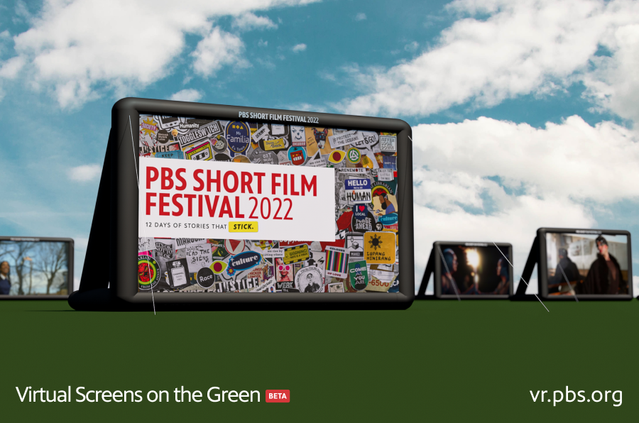
Nick Licitra - 2022-07-26The 2022 Screen on the Green experience gave us many more opportunties to experiment with new features and their supporting user interfaces in both traditional desktop and immersive VR contexts.
Types of GUIs
Coming back to the film fest this year with the base experience already developed afforded us more time to focus on extra features, such as expanding the film screen options from 1 to 27 and adding emoji reactions. These extra features were supported by both 2D and 3D GUIs respectively.
2D GUIs closely resemble the user interfaces that we experience every day on flat screens. 3D GUIs are any sort of user interface comprised of interactable components that exist anywhere in 3D space. So instead of being bound to a flat 2D space, the components can have depth and be positioned in all three dimensions.
WebGL GUI Challenges
WebGL based GUIs are very difficult to develop with because they lack the the modern tooling and infrastructure provided by browsers. A 2D GUI in 3D space is essentially a texture applied to a mesh, such as a flat plane to represent a screen, but without the convenience of CSS, HTML input elements, DOM events, and all of the other built in functionality that are very easily taken for granted. With that being said, Babylon provides tooling for creating 2D and 3D GUIs. The tooling gives us the ability to register pointer events, display text, shapes, images, and manage layouts. This base set of features gives us enough functionality to provide the user with a viable menu experience.
Map
During our early testing of the 2022 experience, it was quickly apparent to us that additional film screens were a little overwhelming for users that are just dropped into a field with dozens of screens scattered around them. More screens allowed users more control on what film they chose to watch, but without knowing what films were playing, where they were playing, and what time they started, the user did not have enough information to make the informed decision of what film(s) to watch. We decided to give users the ability to orient themselves within the world, and to get more information about the screens around them in the form of a map.
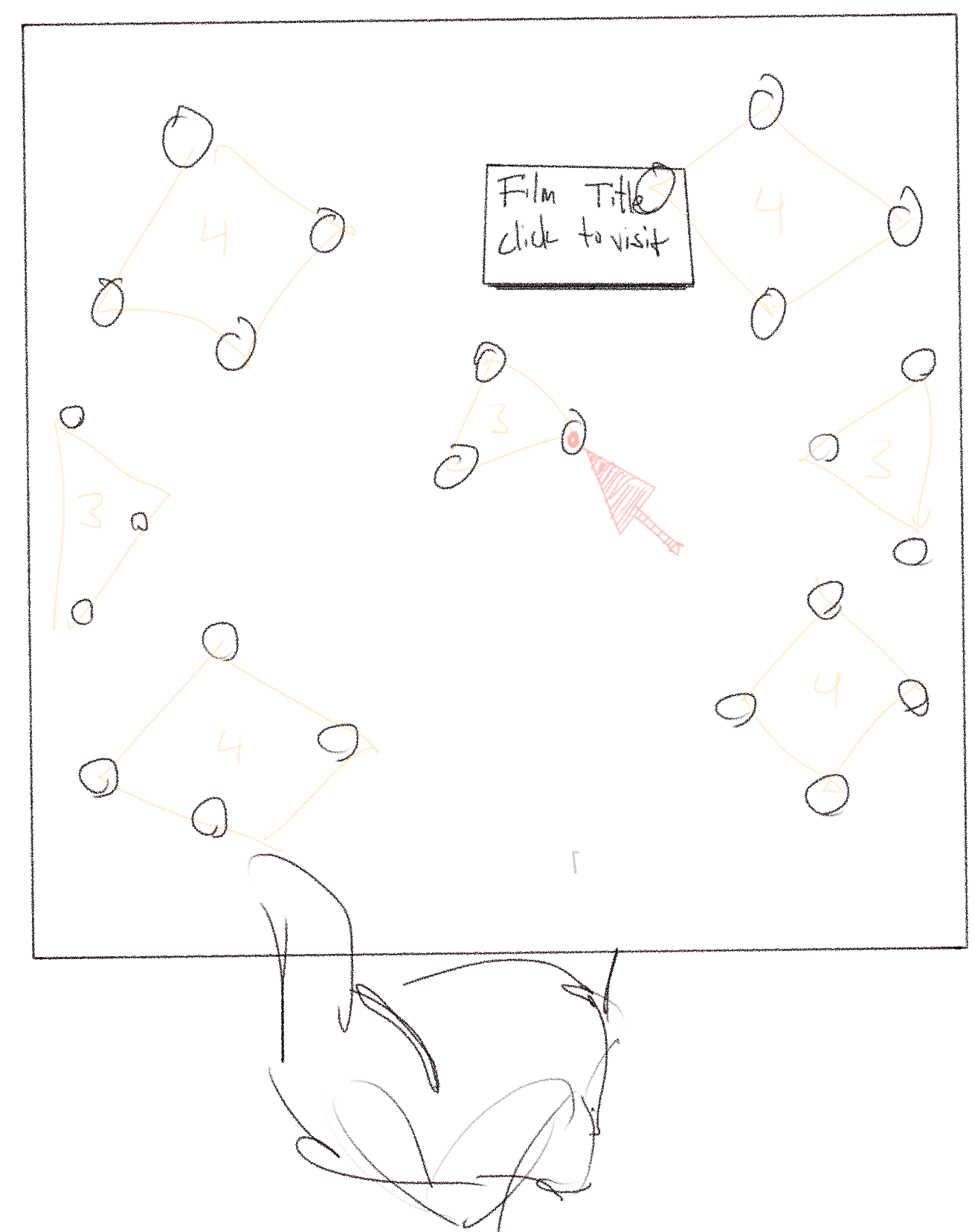
The goal of the map was to do the following:
- Orient the user and give them a guide of what is around them.
- Provide additional context about each film to the movie, such as the title, description, and next start times.
- Give the user the ability to teleport directly to a particular film screen for convenience.
Static vs Dynamic Textures
When creating the map texture, we had two options: create a static image or dynamically generate the image data in real time. Static images would help us bypass all the layout and aesthetic limitations of working with GUIs in WebGL, allowing our design team to work in the tools they know best to deliver a beautiful, high fidelity image. The downside of static images is that we would need to generate a new image anytime we changed the placement of movie screens and the texture coordinates of each film screen would need to be input into JS memory to handle pointer events, which would also need to be updated manually anytime the positions changed. With those factors in mind, we decided to slightly sacrifice aesthetic quality and create the map dynamically.
Early iterations
Before building out the map, we wanted to validate that teleporting could be initiated through click events so we created a very simple hovering 2D GUI. In this video, you can see that the 4 test film screens are represented as green dots, each with their own hover state and click event that triggers teleporting to the respective film screen.
Next, the map began to take shape as we applied a texture to the floating plane, added static labels to each green dot, and most importantly, validated that we could get scheduling data for each film on hover.
Mapping Positions
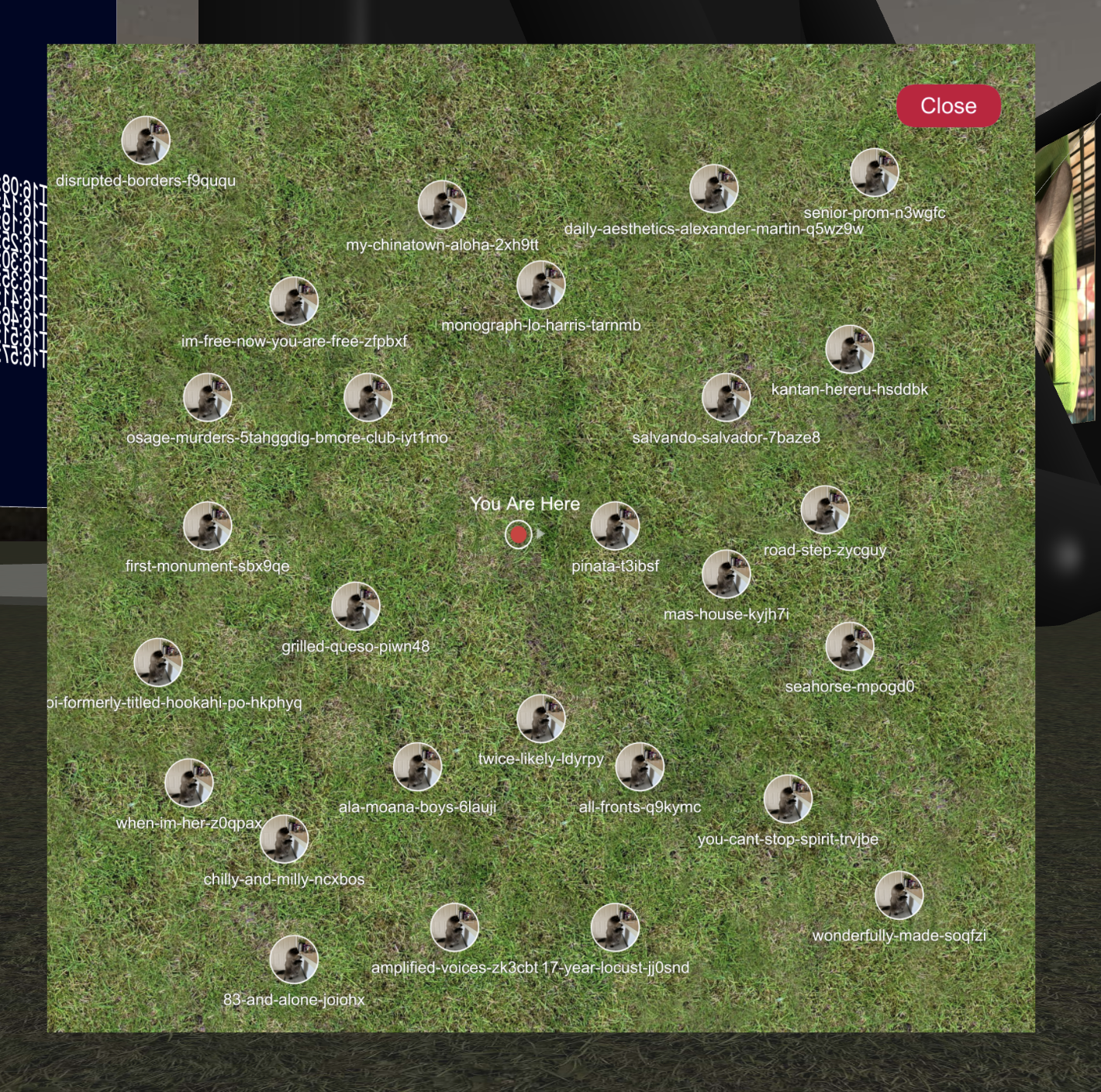
Programmatically translating the film coordinates in 3D XYZ space to a top down texture in 2D UV space was done by taking the X and Z coordinates of each film screen, mapping the 3D X coordinate to the U (horizontal) axis, mapping the 3D Z coordinate to the V (vertical) axis, and normalizing both values to fit within the resolution of the texture. Each film screen was represented by its name and poster image, as clickable elements that would teleport users directly to the film screen.
The same process was applied to the player position in real time to give an accurate representation of the player's position as they move throughout the area.
Did it work?
After we had a functioning rough draft of the map, we took a step back and asked ourselves, was it useful? After testing it ourselves and getting internal feedback, we realized the map did succeed in helping users spatially orient themselves but teleporting made spatial navigation much less of a priority. The overall environment of the experience is basic, with a flat topology and no landmarks or easter eggs, the films were the single points of interest so exploration was not encouraged. What users really wanted was a clear and efficient way to view all the movies available to them, regardless of where they were located on the map. With that knowledge in mind, we decided to replace the map with a directory kiosk.
Directory Kiosk
The directory kiosk contained two screens: the list of films available, and a film details screen that displayed, the title, description, and next start time.
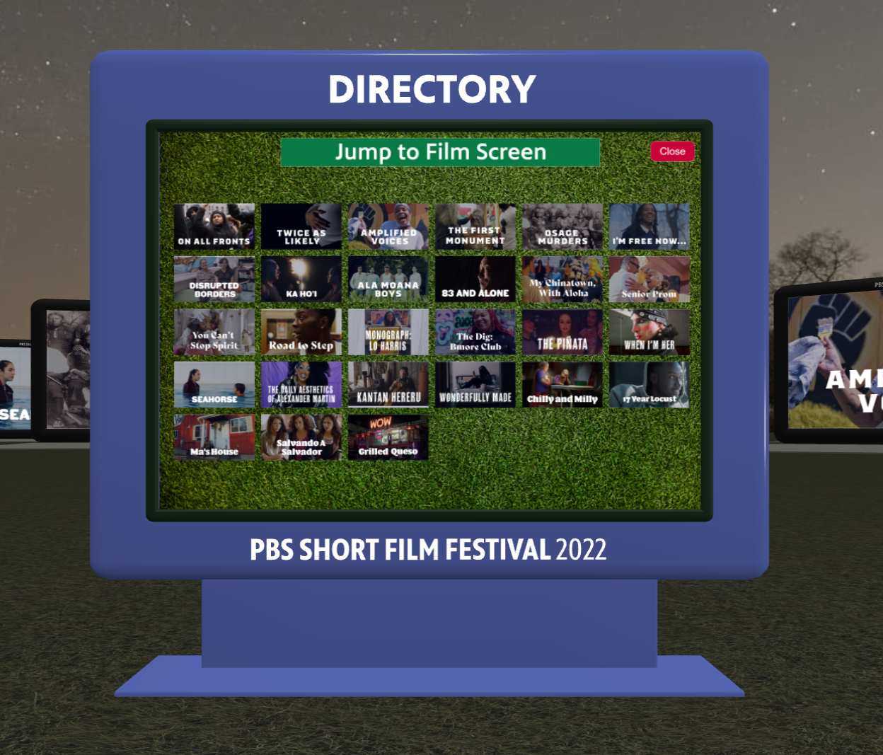
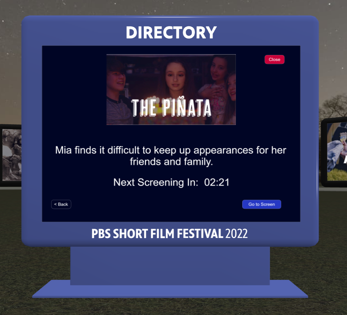
Maps need to position the films accurately, and true to their position in the 3D enviornment. This isn't necessarily the most efficient use of screen space, so without that constraint, the directory style allowed us to maximize screen real estate and present each film with more fidelity in a compact way.
Map & Directory Conclusion
Ultimately, the directory list style approach served our use case better in this particular instance, but the concept of a map has a lot of potential especially in the realm of multiplayer experiences. Perhaps in future iterations, we can circle back on making a richer and more diverse envirnment for users to explore, warranting the use of a map.
Reactions
Another new feature we implemented this year was the ability to react. It was important for us to allow users to express themselves with a predefined set of symbols, so we settled on a discrete set of 9 different emojis. The desktop experience allows the user to select a reaction from the main overlay menu but for VR, we thought there was an opportunity to explore 3D menus and more specifically, a menu system anchored to a motion controller, which seems to be a common design pattern in most modern VR experiences these days.

As mentioned earlier Babylon provides tools for 3D GUIs which made this process very straightforward. Making use of their holographic buttons, we were able to create a 3x3 grid that was anchored to the users left motion controller, allowing the user to select one of the buttons to react, as if they were holding the 3D menu in their hand instead of anchored statically to a single point in the world.
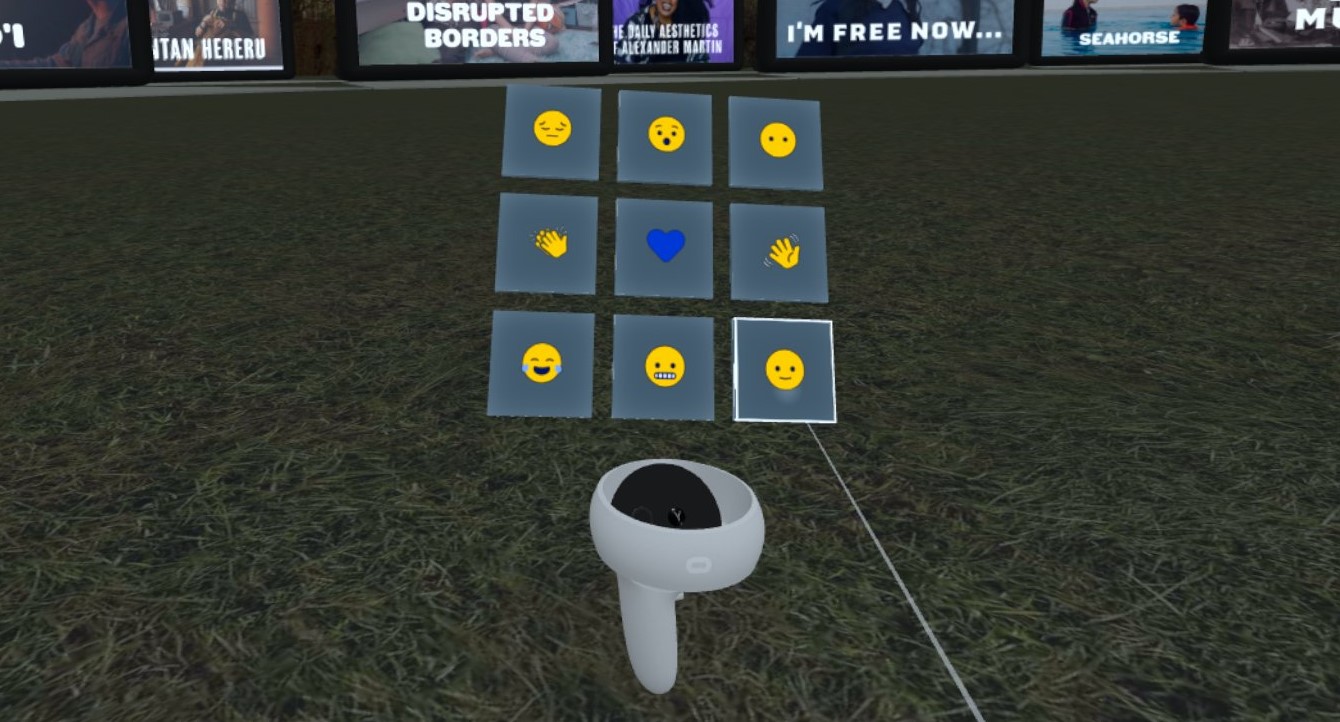
After a user reacts, the reaction is broadcast to all other users, and is animated on top of the reacting users avatar.
Input Feedback
An important part of any user interaction, regardless if it's in a 2D or 3D environment, is providing feedback to the user after they perform an input action. We gave the user the ability to choose a reaction but how would they know it was successfully broadcast to others?
We experimented with a couple of options for displaying reactions back to the user.
In an early test, we explored with emitting 3D respresentations of the reaction.
We also explored a simpler approach of just having the 2D sprite of the emoji displayed in the center of the screen.
We ultimately settled on the 2D approach because it was simple and effective in both the desktop and immersive VR modes.
Reactions Conclusion
Reactions as a medium for expression on the web are nothing new, and neither is the application of this concept in an XR multiplayer environment. But we've exposed a rich vein of experimentation around the sharing of discrete symbols between consumers of public media. If we get the opportunity to come back to this project and iterate further, we have a lot of opportunities to build upon this base, perhaps expanding the reaction pallete and providing more entertaining animations for a depper level of expression.
Conclusion
Engaging immersive applications are made possible by the user interfaces that give users intuitive control over their experience. Traditional 2D based GUIs provide a familiar interface for users to engage with but the extra dimension of 3D based GUIs opens up exponential possibilites for how we interact with our applications. Even though WebGL based GUI tooling may feel nascent compared to its DOM based counterparts, they continue to evolve through the hard work of the community. As we continue to explore the space, it will be important for us to not only use these tools for whimsy and delight, but also keeping in mind accessibility concerns so that public media continues to serve its audience in the metaverse.